A waste of space
You’ve probably seen the default Chrome new tab screen hundreds of times today. A blank search bar, maybe a photo of a mountain. I always felt this was a wasted opportunity, a blank canvas that was ripe for good design.
That wasted space is part of what made me design Tabba, which turns your new tab into a small suite of tools to protect your focus. It’s not a site blocker or a time tracker. It’s meant to give you an awareness of time as you move between tabs, so you can be a bit more intentional about how you spend it online.
The idea behind Tabba
I don’t have a traditional engineering background. I approached Cursor as a way to extend my design systems thinking into something more tangible, like the calendar I look at 50 times a day while bouncing between tasks. Most people look at their calendar in week view, and we’re used to seeing time in a gridded format. That was the initial inspiration for how Tabba works.
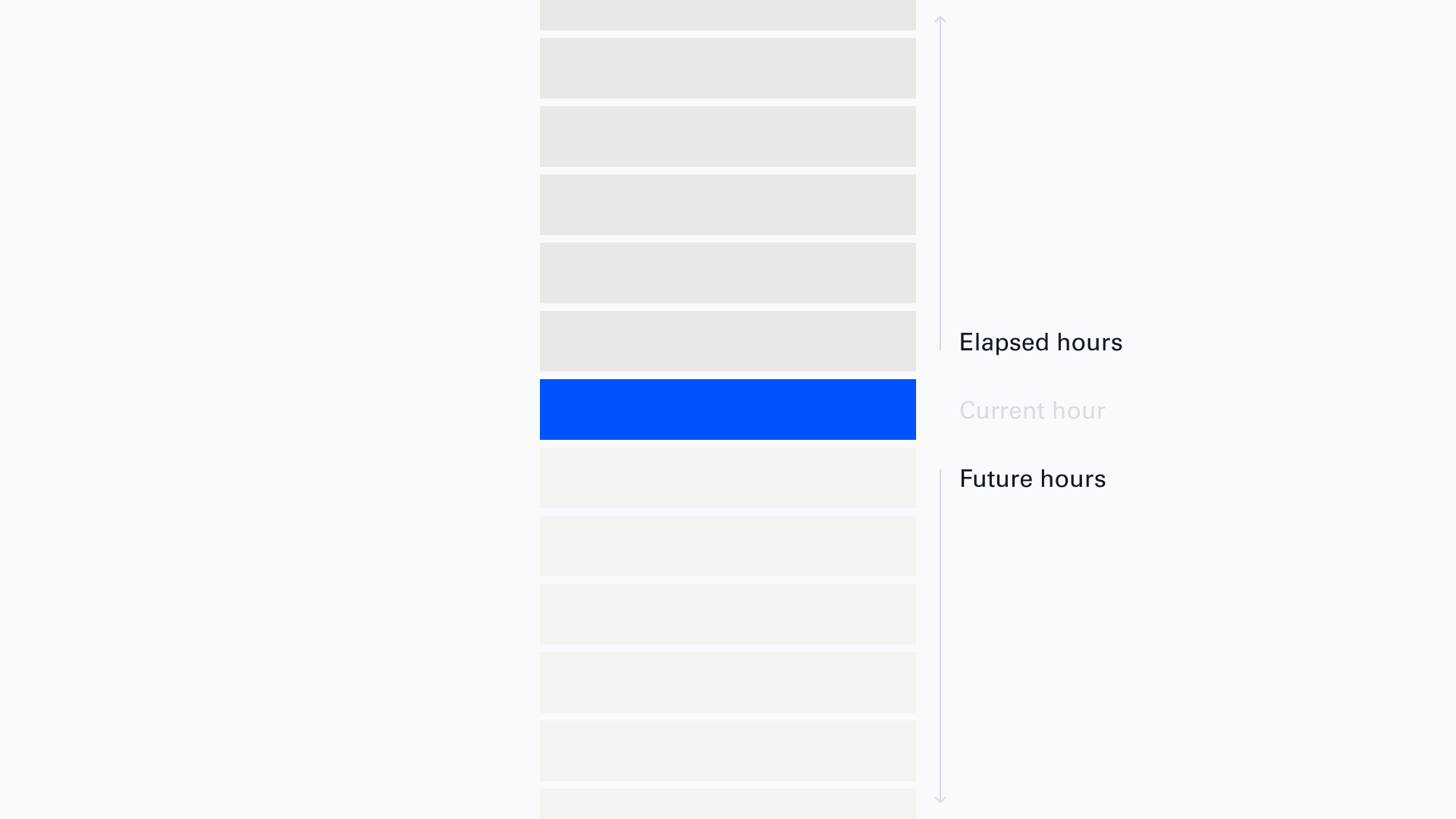
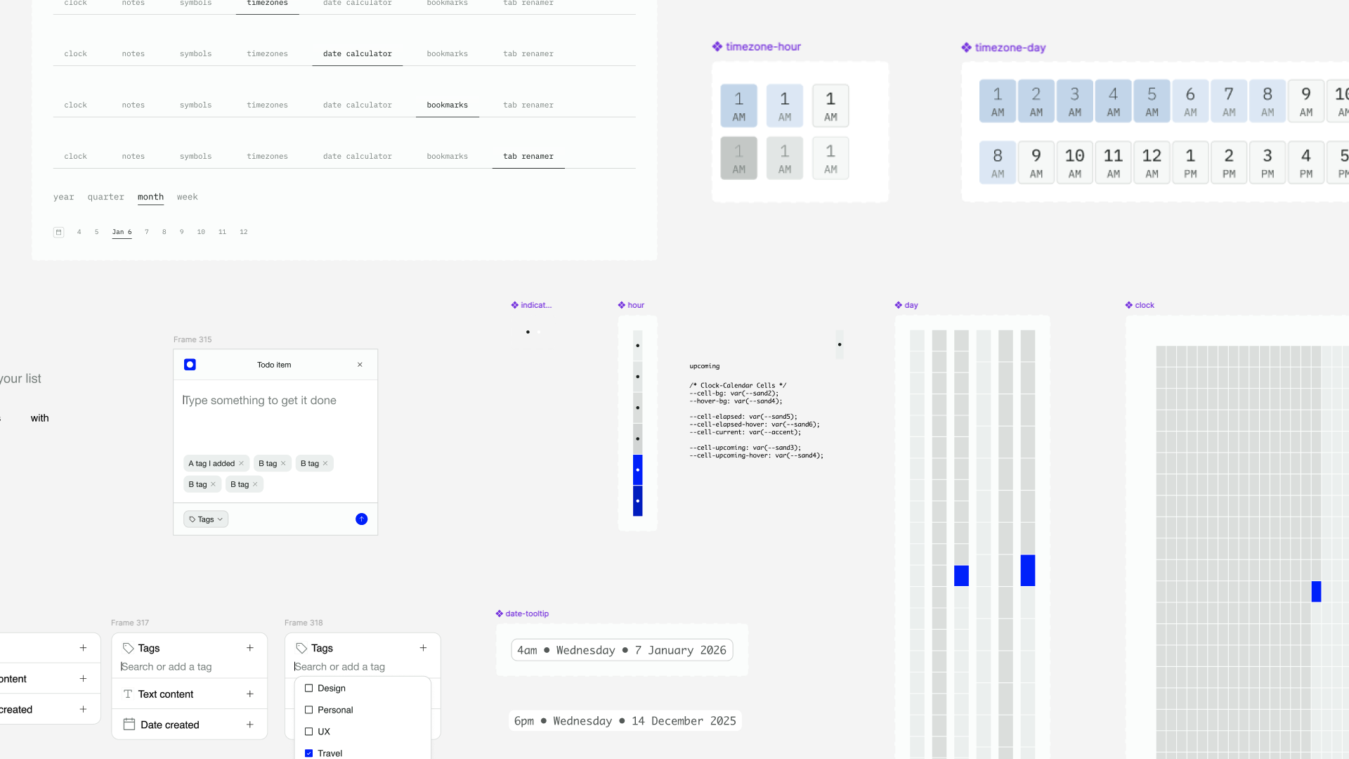
The Tabba calendar is centered on right now, the current hour, which stays highlighted while you view the calendar. The past and the future sit around it for context. You can look at a single day, or zoom out to every hour in a whole time period.
The calendar grid
The calendar shows every hour in a given timeframe: year, month, quarter, or week. Each cell is one hour. Click into any hour to write a note. Notes are instantly searchable, are taggable, and can carry an emoji that marks them on the grid, which helps you read your time visually.
There’s more in the extension: a tagged to-do list, bookmarks, a timezone planner, a symbol picker, and a small pixel-drawing tool. I wrote a full walkthrough of every feature on the Tabba blog if you want the full tour. For this post I want to stay on how it got designed and built.
Constraints and tech stack
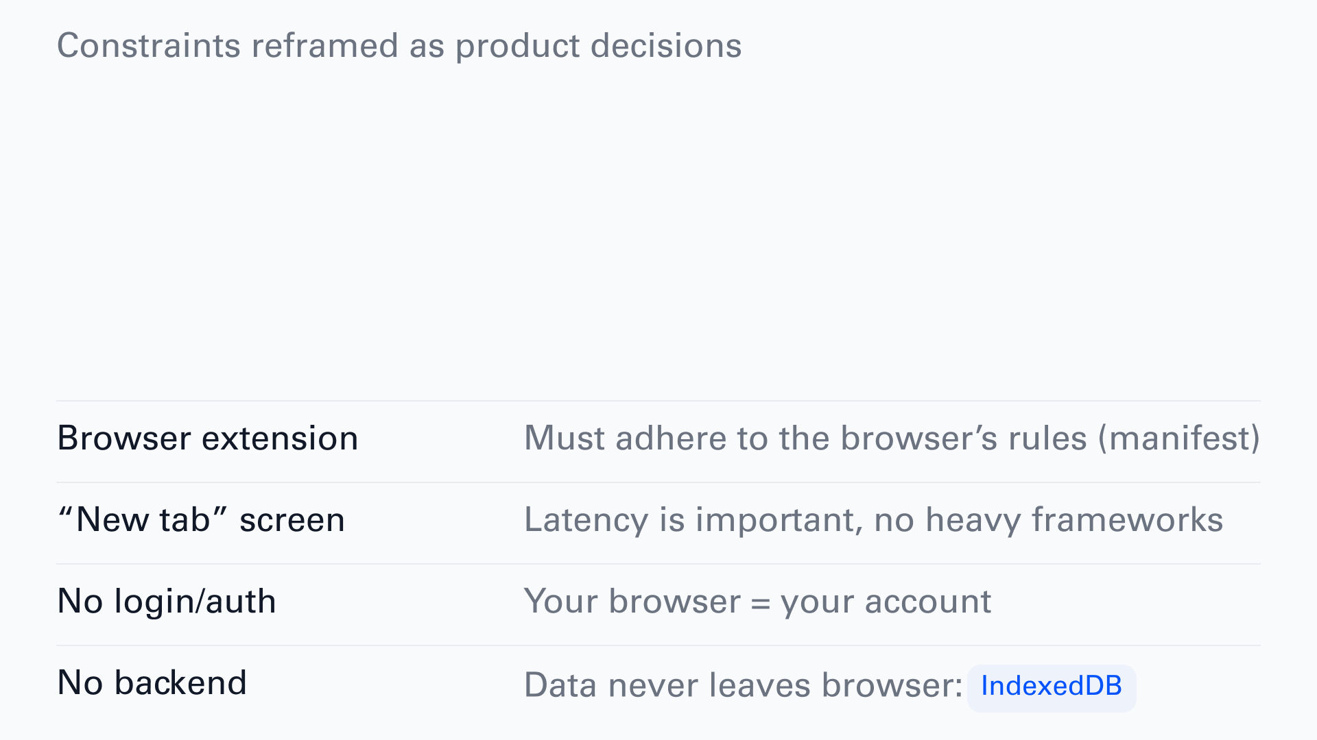
Once I settled on a browser extension, the constraints made themselves obvious. Instead of fighting them, I leaned in:
- It has to follow the browser’s rules (Manifest) which are rules set by Google, Firefox, and Microsoft.
- It’s a new tab screen, so latency mattered from the start.
- I didn’t want authentication or login for v1, so your browser is your account.
- I didn’t want to sync or store anyone’s personal data, so everything lives in your browser in a built-in database called IndexedDB.
That last decision shaped most of the others. Here’s the whole stack I used to design and build Tabba:
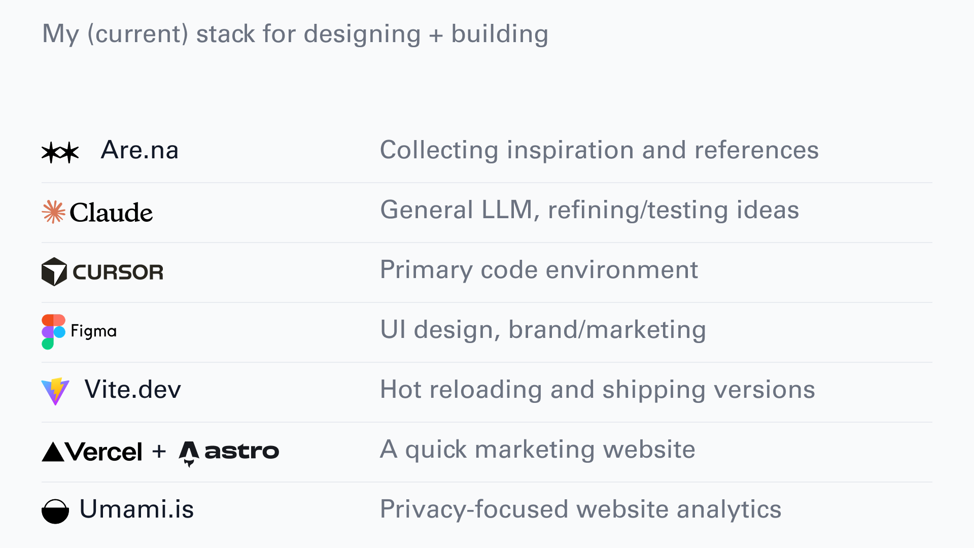
- Are.na for saving references and resources.
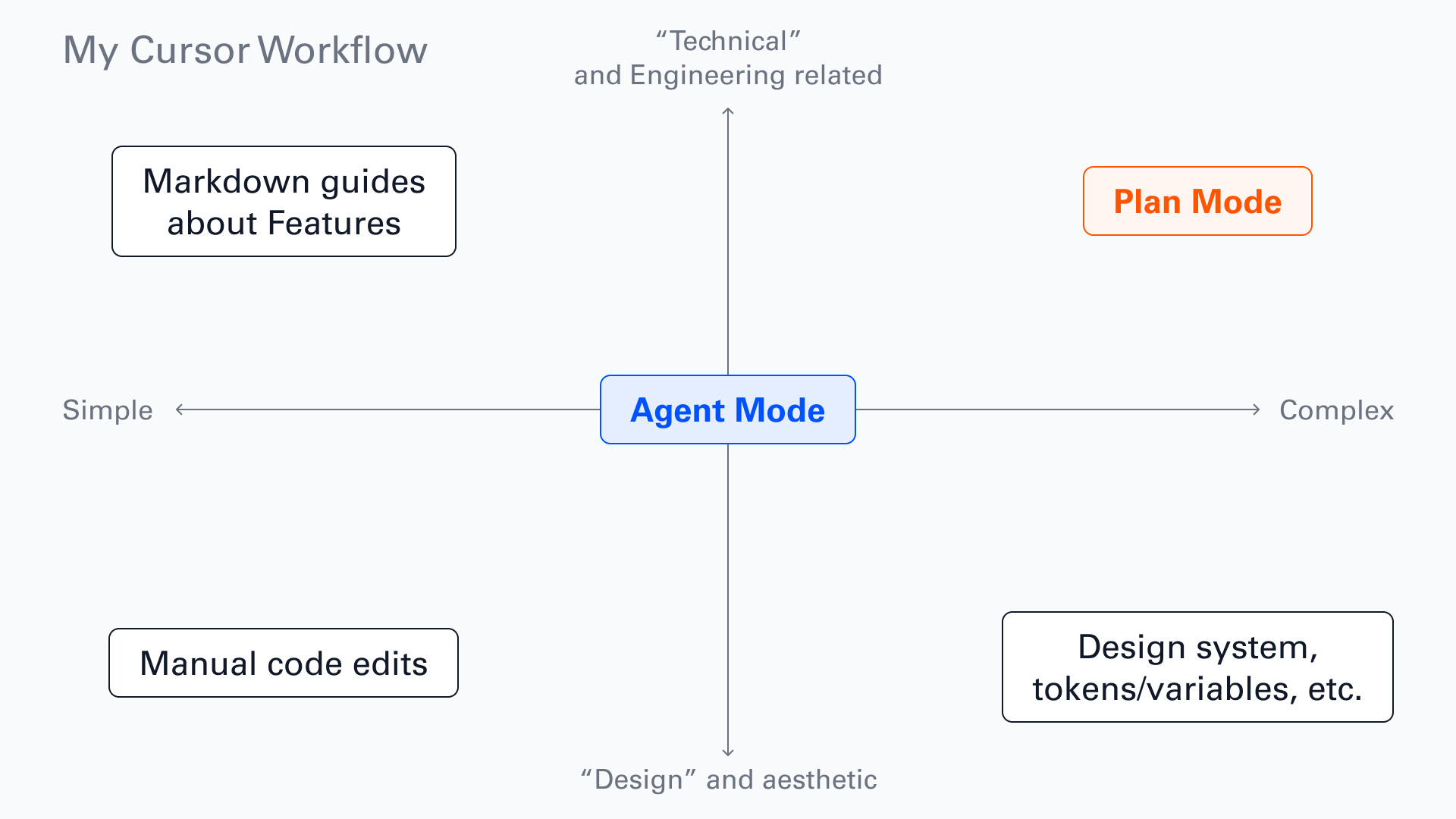
- Cursor as my main coding environment. I use Agent and Plan modes, and it’s convenient to have my code editor, terminal and AI agents all in one place. I like knowing what’s going on in the codebase and being able to quickly iterate on the design/changing CSS and so on.
- Claude (just the desktop chat) helped me poke holes in the idea and iterate on the core focus before I wrote any code.
- I still do like to play around with ideas in Figma, and test this quickly. Sometimes things are faster to do in code, sometimes it’s faster in Figma, just depends on what I’m working on.
- Vite for a tight iteration loop. Because this is a browser extension, the files have to live on your hard drive to test it locally. With Vite, I can change something in the code and see it live immediately.
- I built the marketing site on Astro, which is a static site builder that I’ve been using for a few years now. It’s a great way to build a simple website quickly and it’s perfect for a project like this. It was hosted very simply by pushing to Github and then linking my repo to Vercel.
- I used Umami.is for privacy-focused analytics. Since the extension doesn’t collect any user data, I wanted to carry this through to the marketing website.
Design and planning
I think about this Karri Saarinen tweet a lot. The CEO of Linear, describing how they design: “The design is only a reference, never any kind of deliverable itself.”
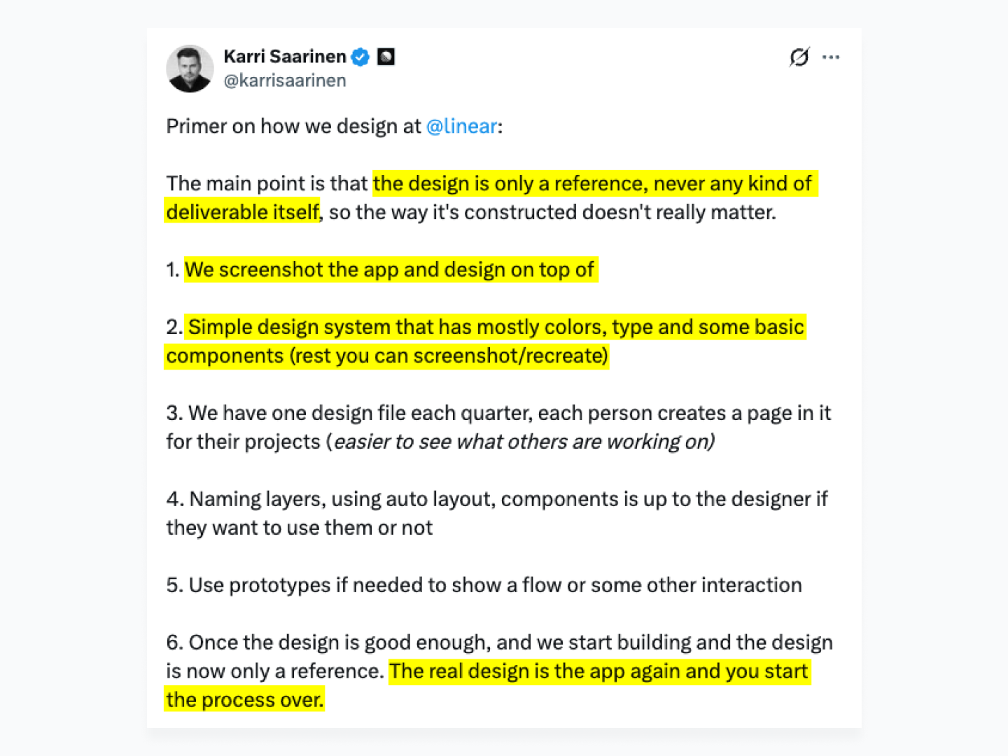
They screenshot the app and design on top of it. Their Figma file is a simple system of type, color, and basic components. The line that stuck with me: “The real design is the app again and you start the process over.” What matters is what people actually use, the live app, not the Figma file. Put the effort into QA on the real thing.
I did start Tabba in Figma with a barebones design system, just to get pieces on the page and see how they fit. The core layout is minimal, but laying it out still mattered. I used Radix for its 12-step color system, which gave me light and dark mode, accessible palettes, and a set of themes I could hand to users for customization.
Then I wrote a product requirements document (PRD). Before touching code, write your idea down as if you’re explaining it to someone else. It’s as much for you as for the model/LLM that’s going to help build it. Slowing down to make decisions on paper is cheap, changing them later is not. My PRD answers a few simple questions:
- What are we doing, and why?
- Who is it for? The target audience.
- How do we plan to solve the problem? Features and user stories.
- Creative direction. How do we differentiate, surprise, and delight?
- Technical and engineering aspects, as best I could work out alone or with AI. Models are happy to build something needlessly complex, so it helped to understand how the thing works, so I’d know where to look when it broke.
There’s a culture right now of building as fast as possible with AI, and the PRD can feel like a blocker. For me it was the opposite. Taking a beat to be intentional meant I burned fewer tokens and did less redesigning later.
Building in Cursor
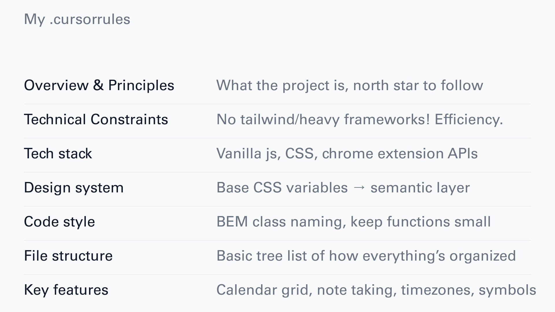
I combined my full PRD with a prompt in Claude to generate a numbered task list and a .cursorrules document to get started. My cursorrules is pretty simple:
-
Overview and principles: the north star for the project.
-
Technical constraints and tech stack.
-
Design system and code style.
-
File structure and key features.
My Cursor workflow, end to end:
-
New Cursor project
-
Install Vite, dependencies, the design system.
-
Open a terminal,
npm run dev, which creates a/distfolder with the extension files on your hard drive. -
Chrome, Extensions, Load unpacked, point it at /dist.
-
Design and build. Mostly Agent mode in Cursor, auto model.
-
To ship a version,
npm run build:all, which exports a file like0.7.4-chrome.zip. -
Upload that to the web store with screenshots and a description.
I spend about 90% of my time in Agent mode. Bigger moves go through Plan mode, and for simple things like CSS and interactions I edit the code by hand. The thing that keeps quality up is testing functionality while I’m working with the agent, not after. For important/complex features I have the agent write a markdown guide, so I can reference it later or hand it to a future session as context.
Testing and shipping
I was apprehensive about performance before launch. My biggest fear was latency for people who use Tabba heavily and store a lot of data.
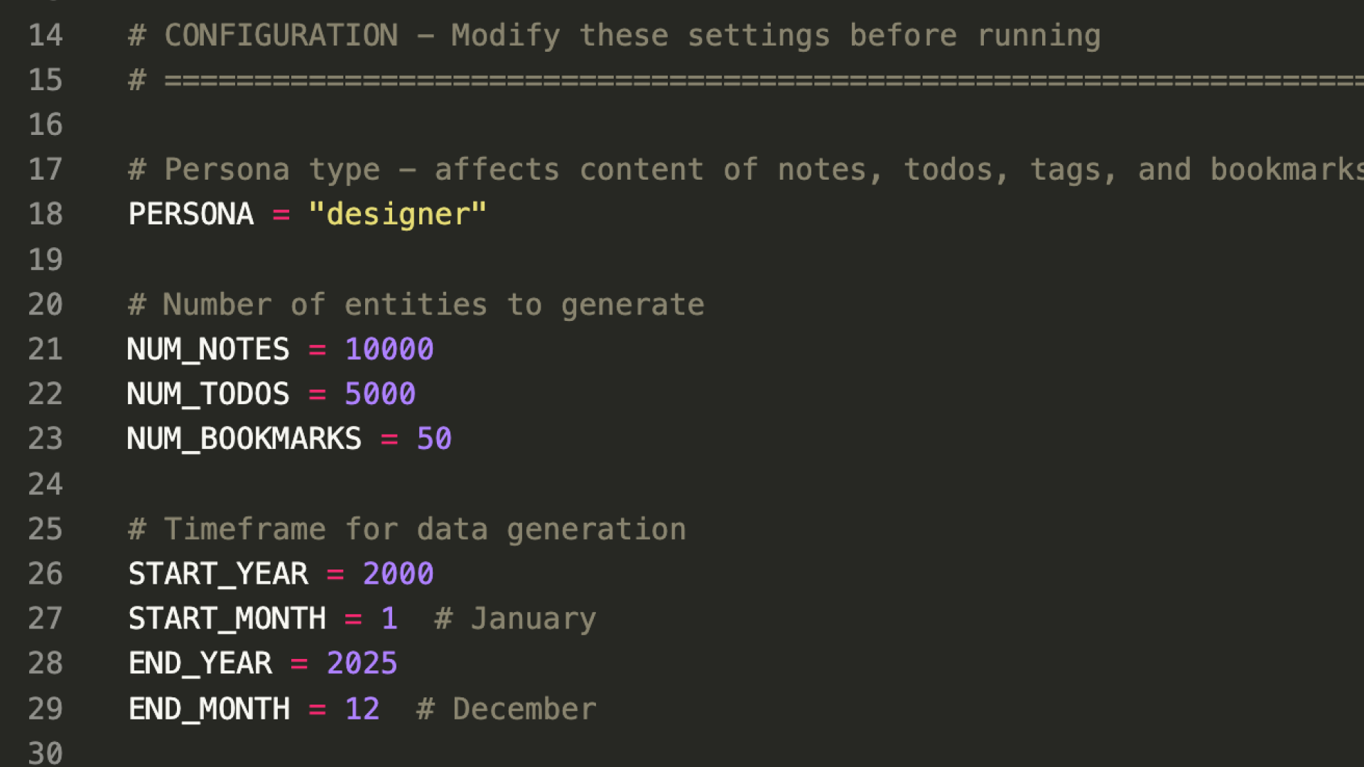
I’d built in JSON import/export early, so users could move their data in and out. I used a Cursor agent to write a Python script that generated a massive dataset simulating someone using Tabba for over 25 years: 10,000 notes, a pile of to-dos, the works. I imported various versions into Brave, Chrome, Firefox, and Edge, used it for a few days, and performance held with no noticeable lag. That gave me the confidence to move forward.
Shipping versions
I set up a few scripts so I can ship with semantic versioning:
npm run version:update 0.7.5updates the version across the manifest, settings page, and a few other spots, so I don’t forget anything. The version number (0.7.5 in this case) also gets passed to the uninstall survey which appears when users uninstall the extension, helping me understand which versions people are uninstalling and why.npm run zipbuilds the app and zips a version for each browser.npm run zip:firefox-sourcegives me the consolidated source code Firefox requires.
Everything uploads to the respective stores. The first review took up to 7 days. Updates are quicker, usually 1 to 4 days depending on how much changed. I assume a company like Google is using ML to surface the diffs between versions.
Beta testing
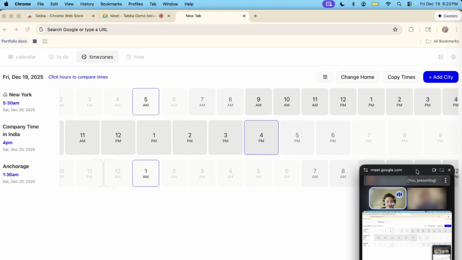
I launched first as an unlisted Chrome extension so I could send it to beta testers. I reached out to friends and colleagues and ended up with 12. I used Cal.com to book each one and ran the tests over Google Meet, sending the Chrome Store install link 15 minutes before each call.
I asked each tester to share their screen while they installed it. Replacing the new tab is an unfamiliar pattern, so I wanted to see whether people understood what was happening. Then I asked for their first unfiltered reaction and what they thought each tool did. Things broke, which is the point. One tester added the Mumbai timezone, which has a 30-minute offset, and it broke the timezone planner. I shipped a patch before public launch, so in this moment, beta testing was well worth the time I spent chatting with everyone.
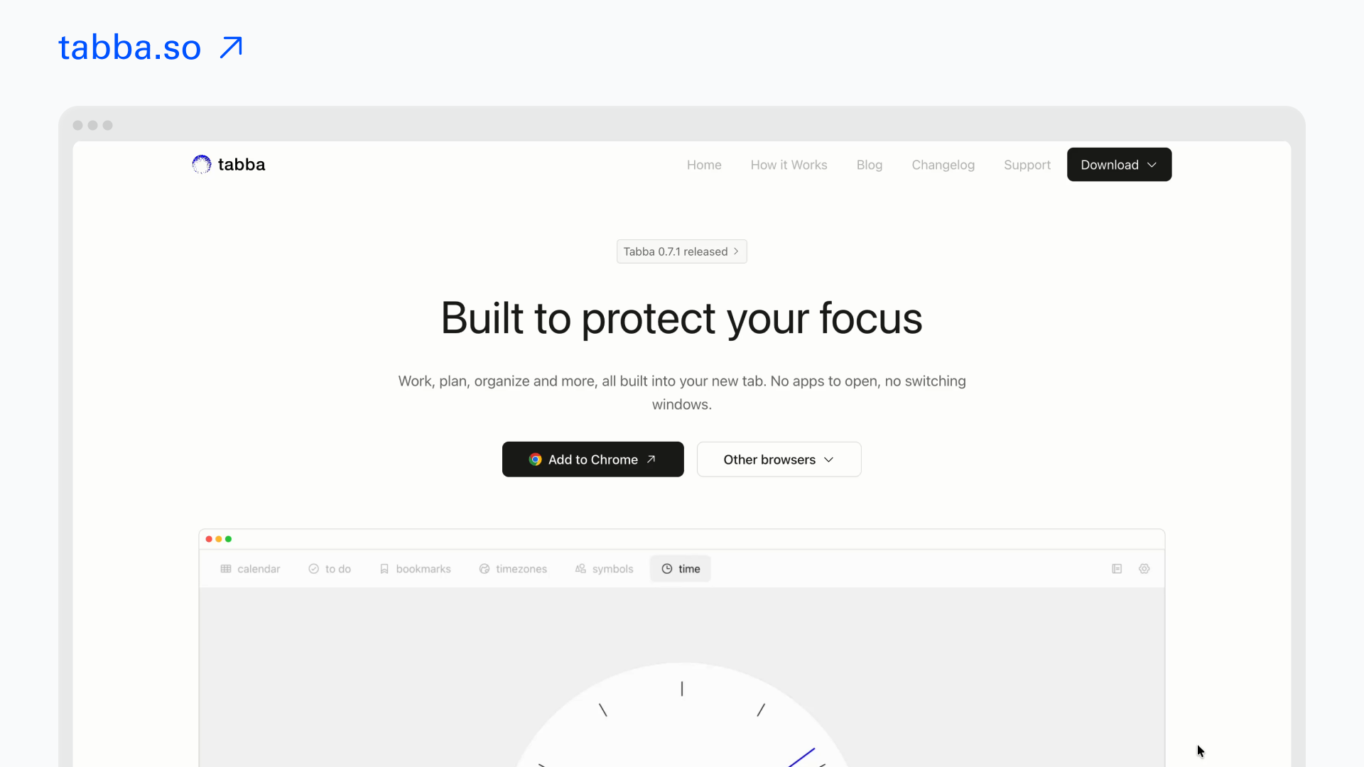
The marketing website
The marketing site is simple and will change over time. The goal is conversion: get people to install. So it focuses on benefits and shows what the app actually looks and feels like with lots of visuals.
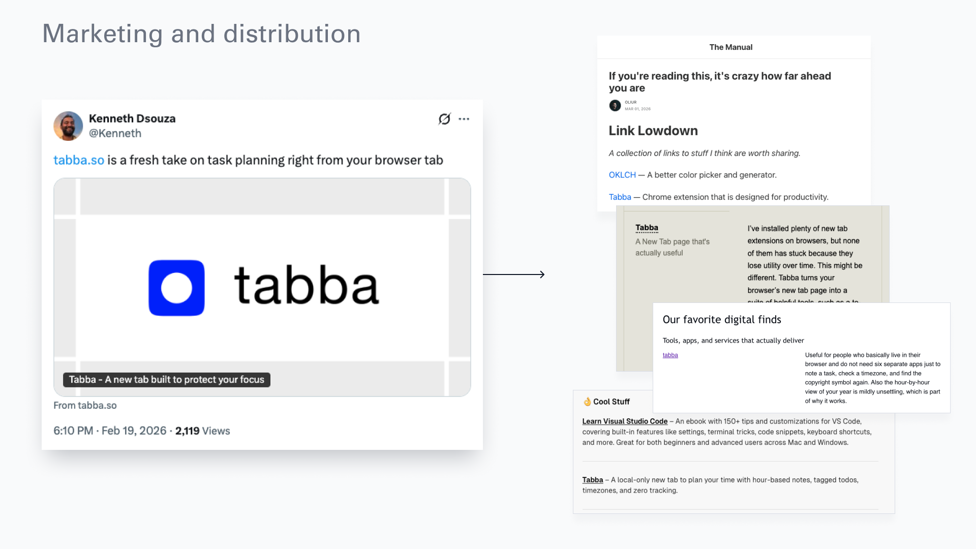
A good website mattered because I didn’t do much marketing myself. Someone named Kenneth posted it organically on Twitter, which got me into a few Substacks and newsletters, and that’s brought a steady trickle of users.
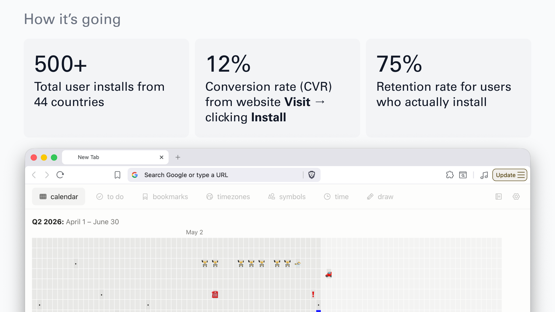
How it’s going:
As of writing this, in June 2026:
-
500+ installs, users in 44 countries.
-
12% conversion from website visit to install click.
-
75% retention for users who install. Room to improve, but it’s a start. Most people who uninstall want a third-party integration, Notion or Google Calendar. I’m undecided on whether to support those. Part of me likes the simplicity of the standalone extension as it is.
What I learned (so far)
Start small. For me that was a browser extension. I’d tried jumping straight into a SaaS before, with a backend, a database, authentication, all that complexity, and the results were mixed. Starting small built my confidence and produced something that actually worked.
Build incrementally, test constantly. Building in small pieces and testing along the way let me validate the idea quickly and refine as I went.
Decisiveness beats slop. I had a firm idea from the start. Rough designs and a PRD brought clarity to the build and let me skip the AI-slop phase, so I got where I was going with less redesigning.
Use AI as a tool, not an appendage. It’s tempting, but don’t let the computer think for you. AI is best when it amplifies what I can already do and helps me learn along the way. I’ve had a cursory interest in web development since I was young, and building Tabba let me go deeper into the parts of frontend design that interest me. When I add a feature, I have the agent write me a markdown guide, which helps me internalize what I’m building, how it connects to the system, and how I might extend it later.
What’s next?
For Tabba itself, I have a backlog of feature requests from users: data sync across multiple devices, a pomodoro timer, as well as a bunch of improvements that I’d like to make to the core experience. Tabba is not currently monetized but I do have plans in the future to keep the core experience free while adding in premium features for people who wish to upgrade.
But what I’m more interested in right now is what comes next for my own practice: folding AI deeper into how I design, and getting closer to the final product as I go. If you’re a founder or a creative working on something where that’s useful, I’d love to talk.
If you’ve made it this far, thanks for reading. You can find me on LinkedIn, see more on my portfolio, and catch works-in-progress (including my baking!) on Bluesky.